Test methods and results
Manual testing, combined with automated load testing, was conducted to examine how misconfiguration of map extent and layer scale visibility would impact editing and viewing workflow performance and user experience. Desktop machine instances, as well as ArcGIS Pro and the web apps were monitored as workflows were conducted under load.
Scripted testing was performed to simulate the steps an editor would take when performing the defined workflows. Upon test completion, results were assembled and analyzed to compare desktop utilization and end-user efficiency with different hardware configurations.
Test methods
To test the impact that map extents and layer visibility ranges can have on performance and user experience, a few modifications were made to otherwise well-configured maps that were previously tested and confirmed to have good performance and user experience:
- The Dashboard web map (used for the view asset workflow): the “electric layer” visibility was changed from neighborhood level to county level, and the default extent of map was changed from neighborhood to counties.
- The Experience Builder web app (used for the summarize assets workflow): electric line layer visibility and default map extent updated with the same settings as above.
- The ArcGIS Pro project map (used for editing workflows): removed visibility ranges of ‘medium voltage conductor’ layer inside the ‘electric line’ group layer, and the default map extent was set to 1:500,000.
These changes were chosen to view the impact of map extent and layer visibility configurations across different kinds of foundational electric utility network information management workflows. The read-only Utility Network service used for Viewer workflows operates on the hosting server, while editing workflows utilize the UN service hosted on the GIS Server. Therefore, the impact of poorly configured layer visibility and map extents on editing and viewing workflows can be seen on the respective system component’s instance.
Performance testing tools
Because ArcGIS is a multi-tier system, performance tests were conducted across client, service, and data storage tiers, as well as the underlying infrastructure itself. In this test study, JMeter was used to simulate the user workflows and measure system performance under different loads. ArcGIS Pro requests were recorded and then replayed to simulate load in addition to manual workflows that were performed to assess end-user experience.
Windows Performance Monitor and ArcGIS Monitor were also used to monitor resource utilization across different components. For more information, see tools for performance testing.
Test results
The system was tested in three scenarios to understand how poor map configuration impacts performance and user experience at different loads. For each load scenario you can compare the impact relative to an otherwise identical system with optimized visibility ranges (left). At a high level, test results show that maps with even one or two inappropriate layer visibility and map extent configurations can greatly impact system utilization and user experience, particularly at higher loads.
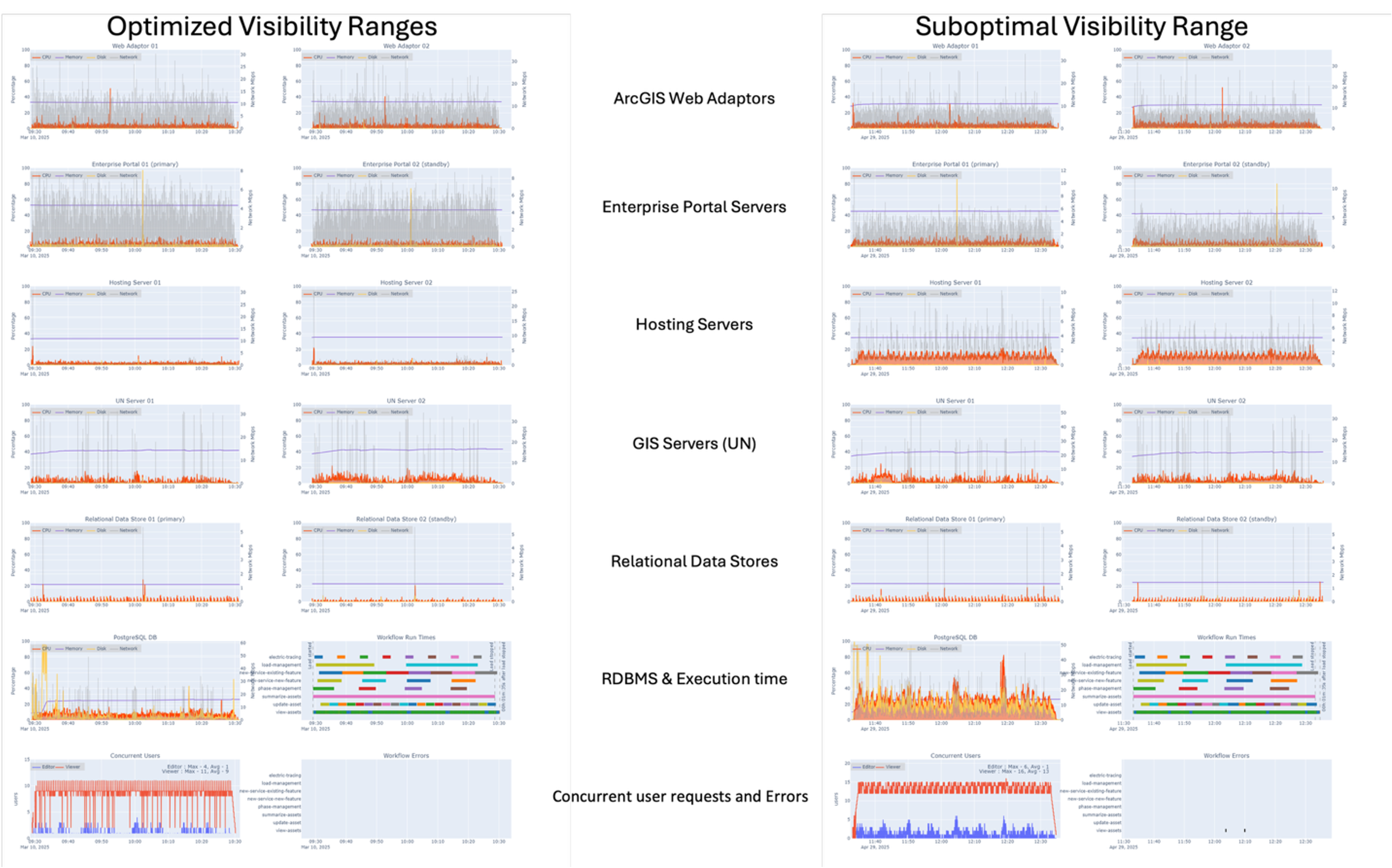
Test scenario : 2x design load
 Observations:
- Overall, acceptable utilization across system components, but with double the utilization on the database, Utility Network (UN), and hosting server instances as compared to the optimized system
- Hosting and UN servers exhibit CPU utilization spikes throughout the run
- Service wait times and ArcSOC utilization remain within acceptable thresholds
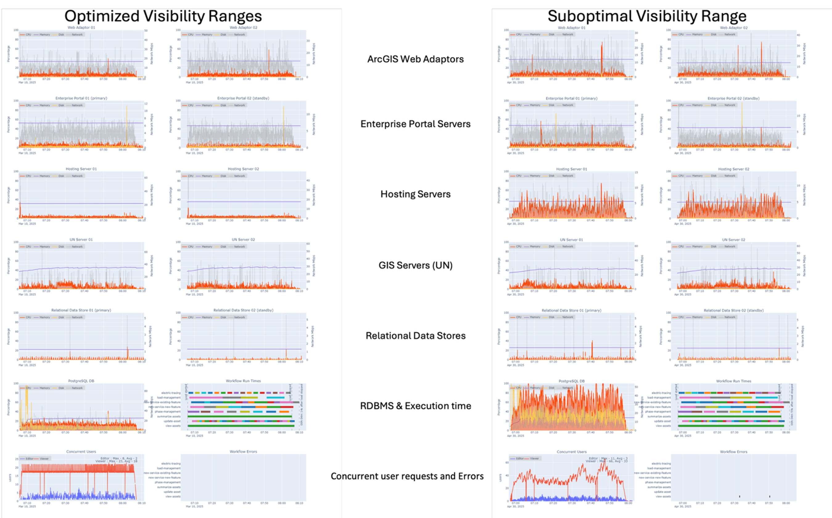
Test scenario : 4x design load
 Observations:
- The hosting server and database exhibit significant resource utilization throughout the test, with roughly four times the utilization as compared to the optimized system
- PostgreSQL instance shows over 200% increased resource utilization as compared to 2x design load
- Service wait times continue to increase
- Most ArcSOCs on the hosting server are busy throughout the run, with some instances peaking
- ArcSOCs on the UN server show linear and gradual increase, less impacted as compared to hosting server
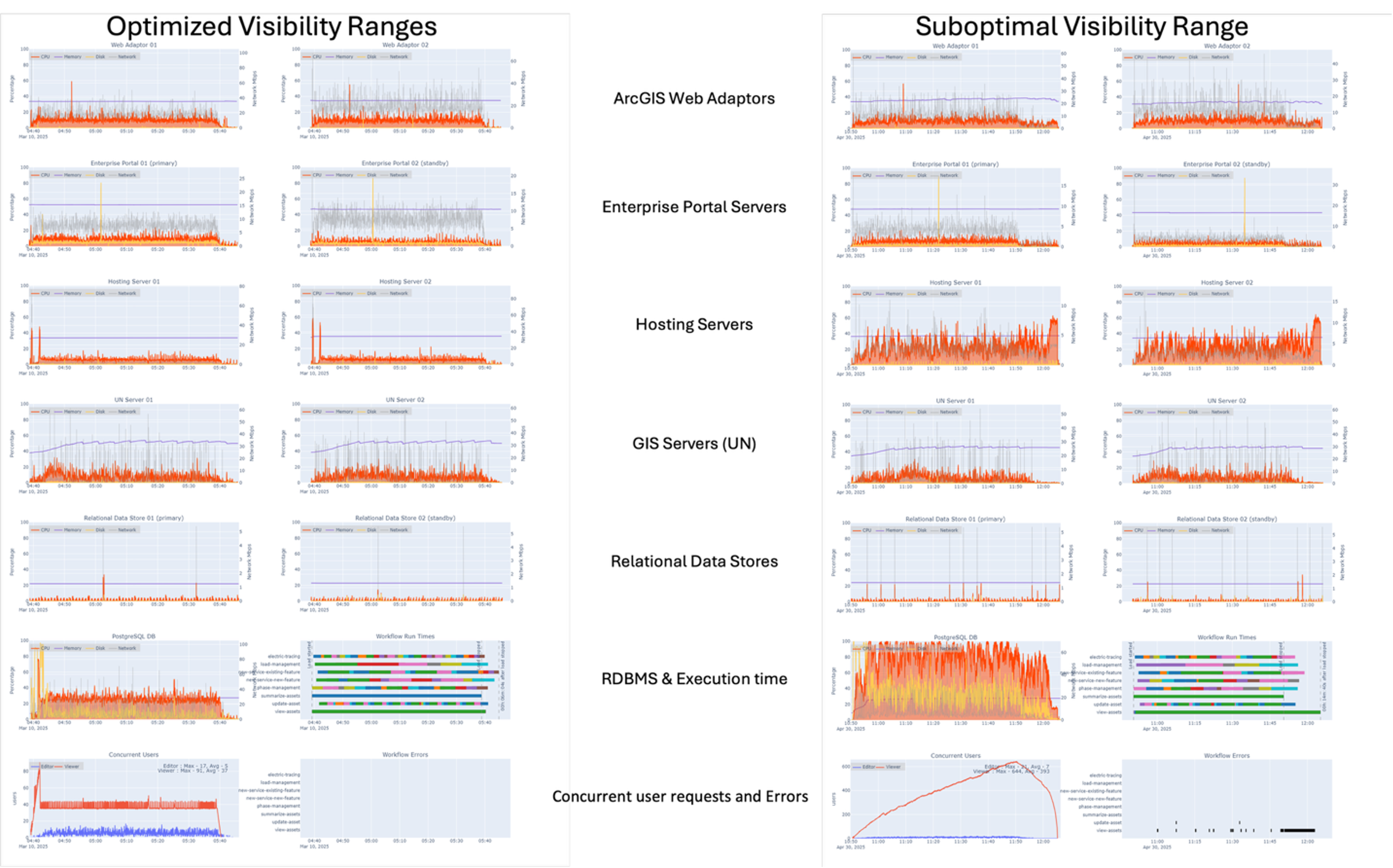
Test scenario : 8x design load (optimized) compared to 6x design load (suboptimal)
 Observations:
- The suboptimal configuration shows overall poor performance with unacceptable service wait times, particularly for viewer workloads running on the hosting server
- In the suboptimal configuration, the hosting servers exhibit roughly four times the utilization at 6x, even compared to 8x design load on the optimized system
- The PostgreSQL instance is reaching its threshold at 6x with a suboptimal configuration, which is more than double the utilization of the optimized system at 8x design load
- Most ArcSOCs on the hosting server reach maximum thresholds with the suboptimal configuration – unusual behavior is observed resulting from the server being busy and unable to retrieve SOC utilization values
- ArcSOCs on the UN server (editors) show linear and gradual increase, less impacted as compared to hosting server
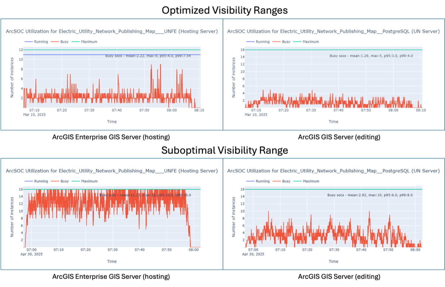
ArcSOC utilization comparison
Increases in ArcSOC utilization often causes an increase in service wait time, which ultimately impacts users’ ability to do their work efficiently. ArcSOC utilization was monitored across all load scenarios. In every test, ArcSOC utilization was notably higher as compared to the system with optimized maps. The graphs below illustrate the significant difference at 4x design load. Compared to the optimized system, the ArcSOC utilization on the hosting server increases by roughly 3 to 4 times and the UN server by about two times.

User experience
To evaluate user experience, workflow step durations were captured. When workflows take longer for users to complete, it signals the system is responding more slowly to their requests. The chart below shows the average time it took users to complete a given step within a workflow in both the optimized and sub optimally configured systems.

In all workflows other than load management, there is a measured increase in total workflow time with increased load. At 6x design load, the view assets workflow takes about fifteen times longer as compared to at 2x. The login and open project step in the update asset and electric workflows take the longest time, with notable jumps in duration as the load on the system increases. Additionally, the locate, zoom to device, and downstream trace steps all have exponential jumps in duration at 6x design load compared to 4x design load.